Multi-role clinical trial & drug management platform
HeaDS is a web platform for managing hemato-oncology clinical trials across multiple hospital sites. It serves five distinct user roles — Investigators, Data Managers, CRAs, Medical Reporters, and Depot staff — each with different permissions and access to data entry, quality checks, and drug management workflows.
Sole designer. I owned the full product design process end-to-end — from discovery research and artefact creation through to high-fidelity delivery — working in weekly collaborative sprints with product owners and key stakeholders.
The platform had been built around the complexity of clinical trials rather than the people running them. Users had no visibility into what was outstanding for their role, no guidance on next steps, and no fast way to find what they needed. Clinical staff were spending an excessive amount of time on administrative work that the platform was supposed to reduce. The redesign was a response to a product that had become unusable.
The redesign delivered four substantive contributions, each addressing a different way the platform was failing the people running the trials.
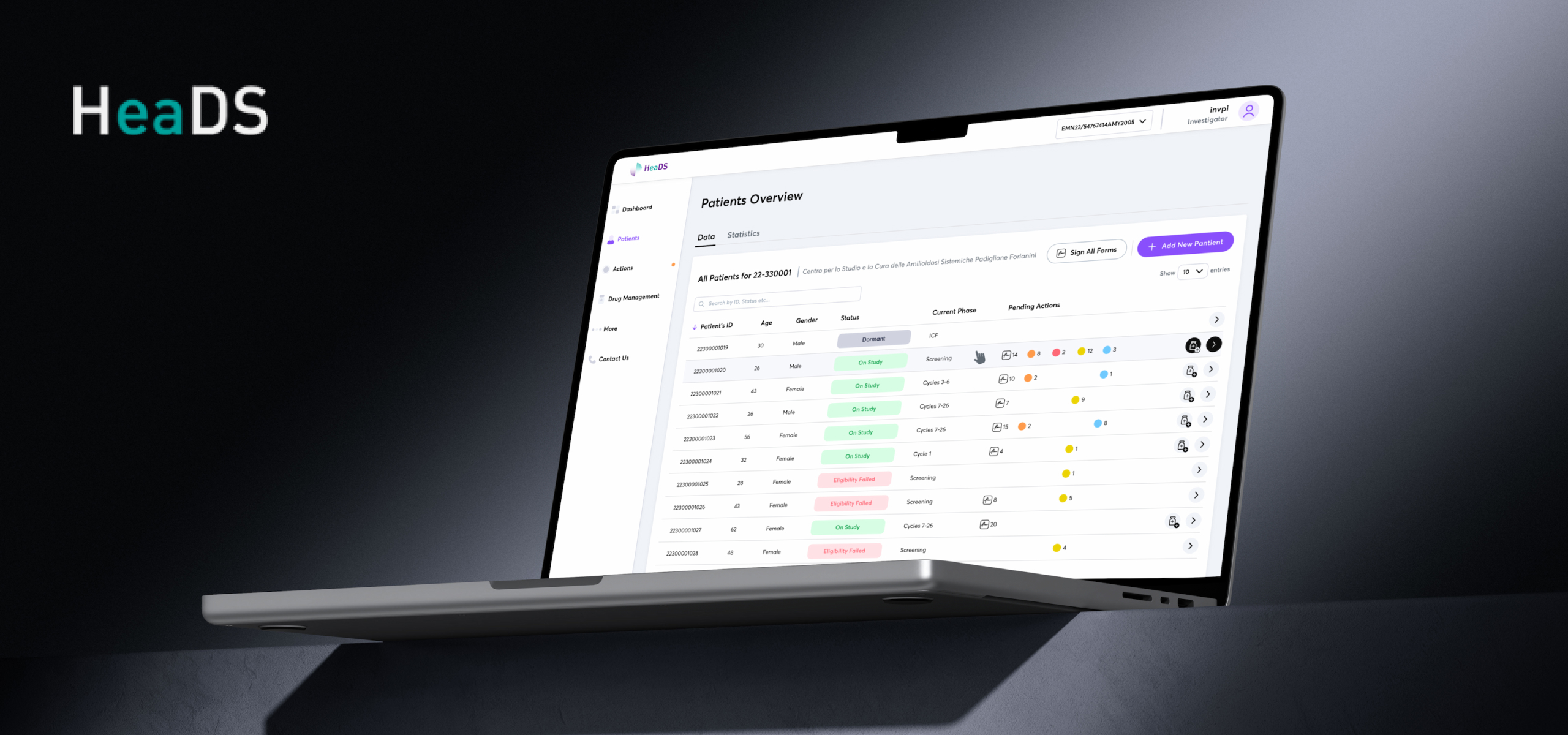
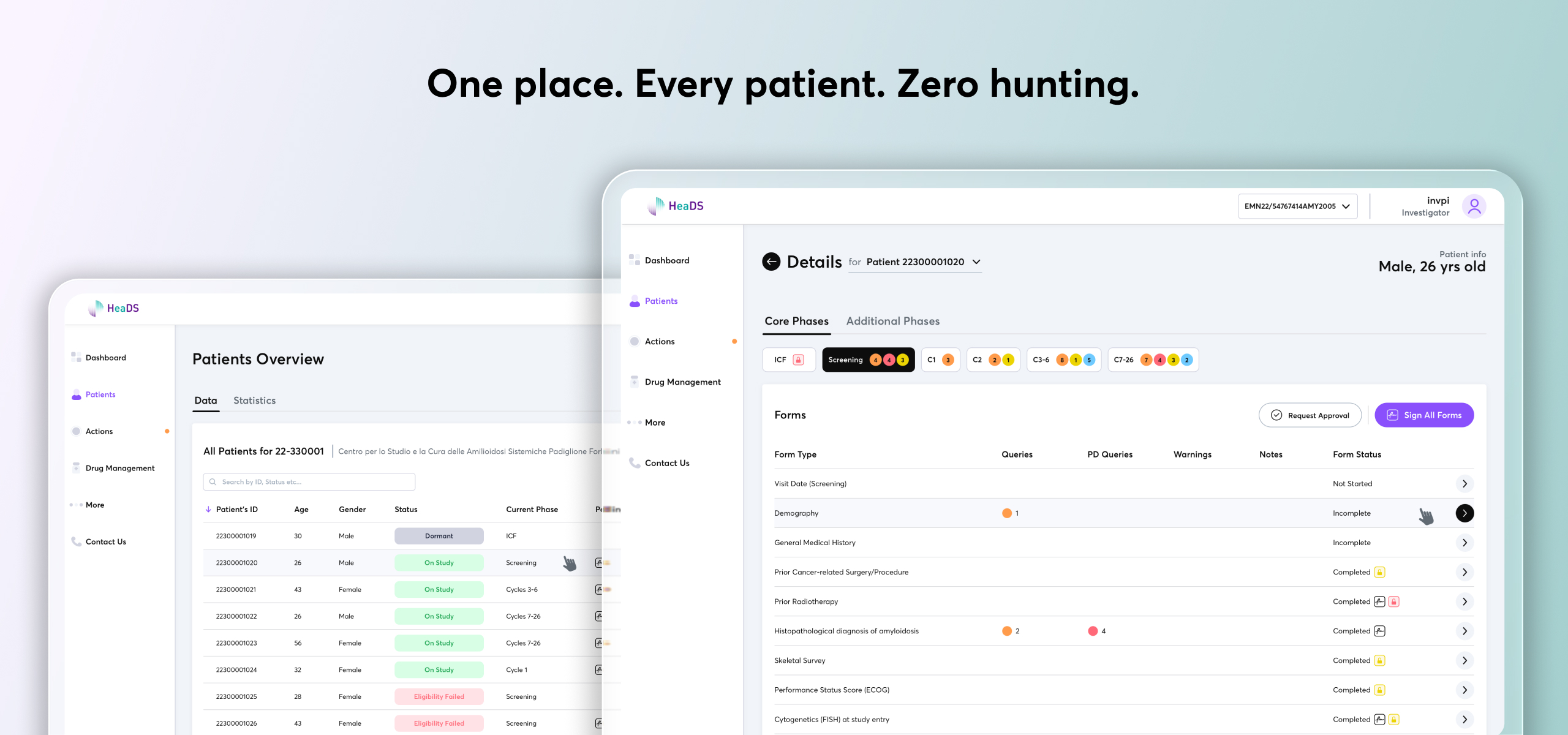
Patients Overview Page — A new per-trial patients page that collapsed a 10-click process into a single interaction, making the entire platform patient-centric.
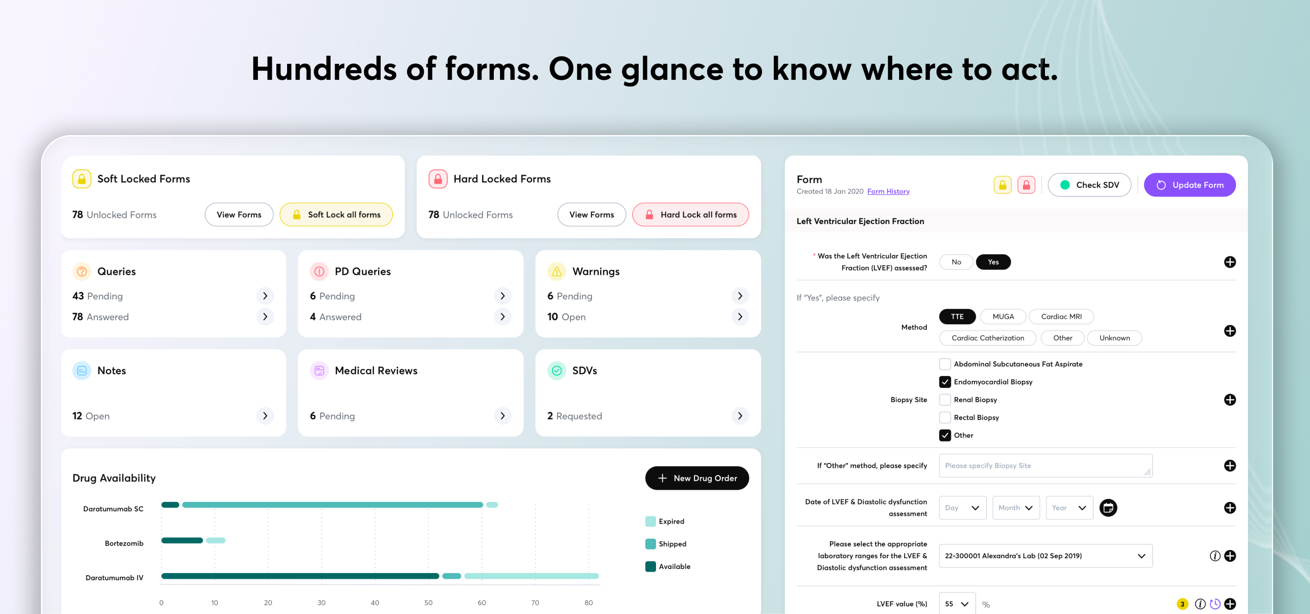
Patient Detail & Form Status — A structured view where users can search by patient and immediately see the number of pending, completed, and new forms — broken down by phase (Core or Additional) and stage (ICV, Screening, C1, C2, C3–6, C7–26). No prior organisation existed for this volume of data, so I reconstructed the information architecture to surface only what matters, indicate where action is needed, and keep the interface clean and navigable despite the density.
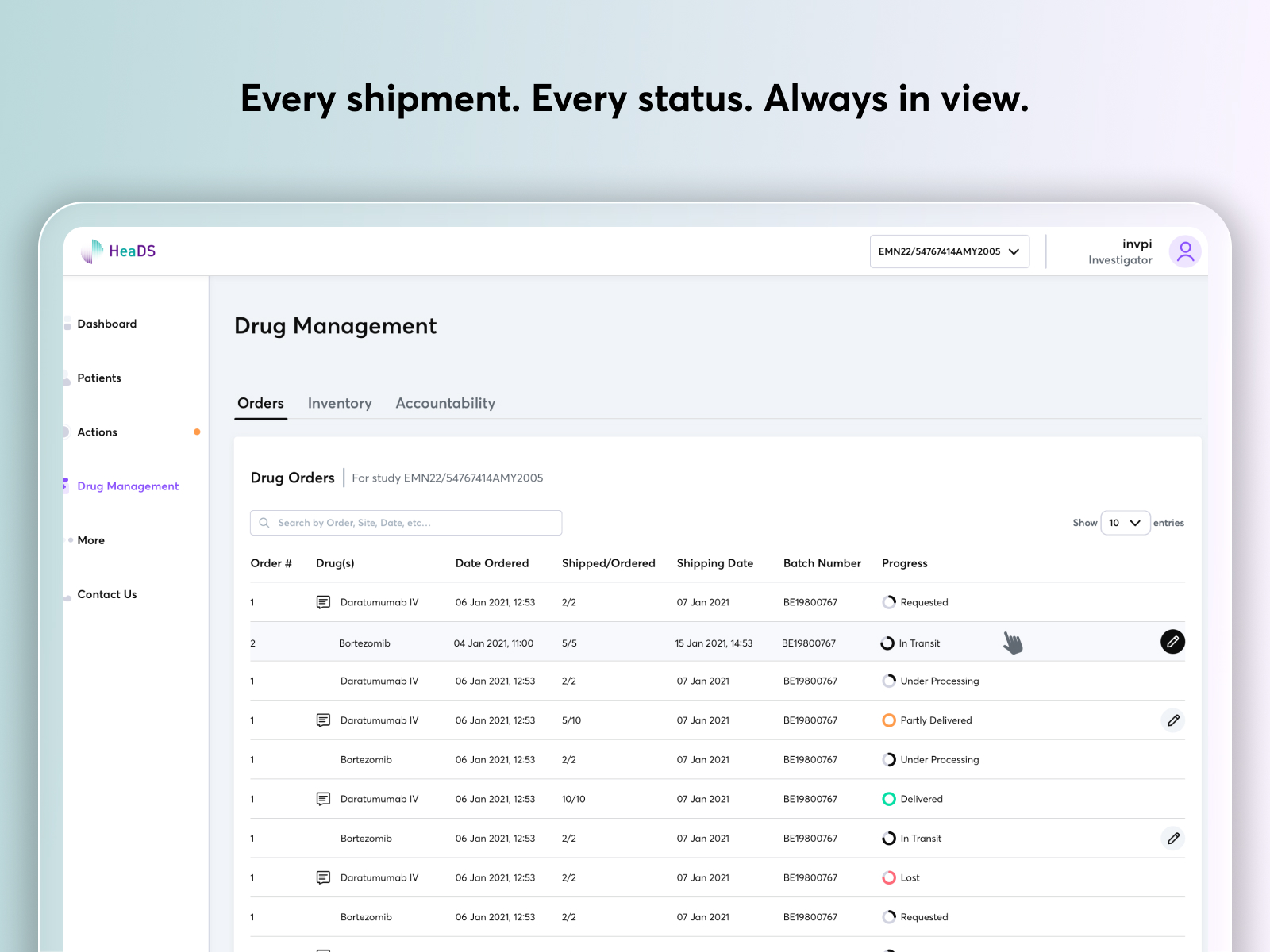
Drug Management — A progress-bar-style view showing where every medical kit sits at each stage of transit, surfaced only to the roles with the relevant permissions.
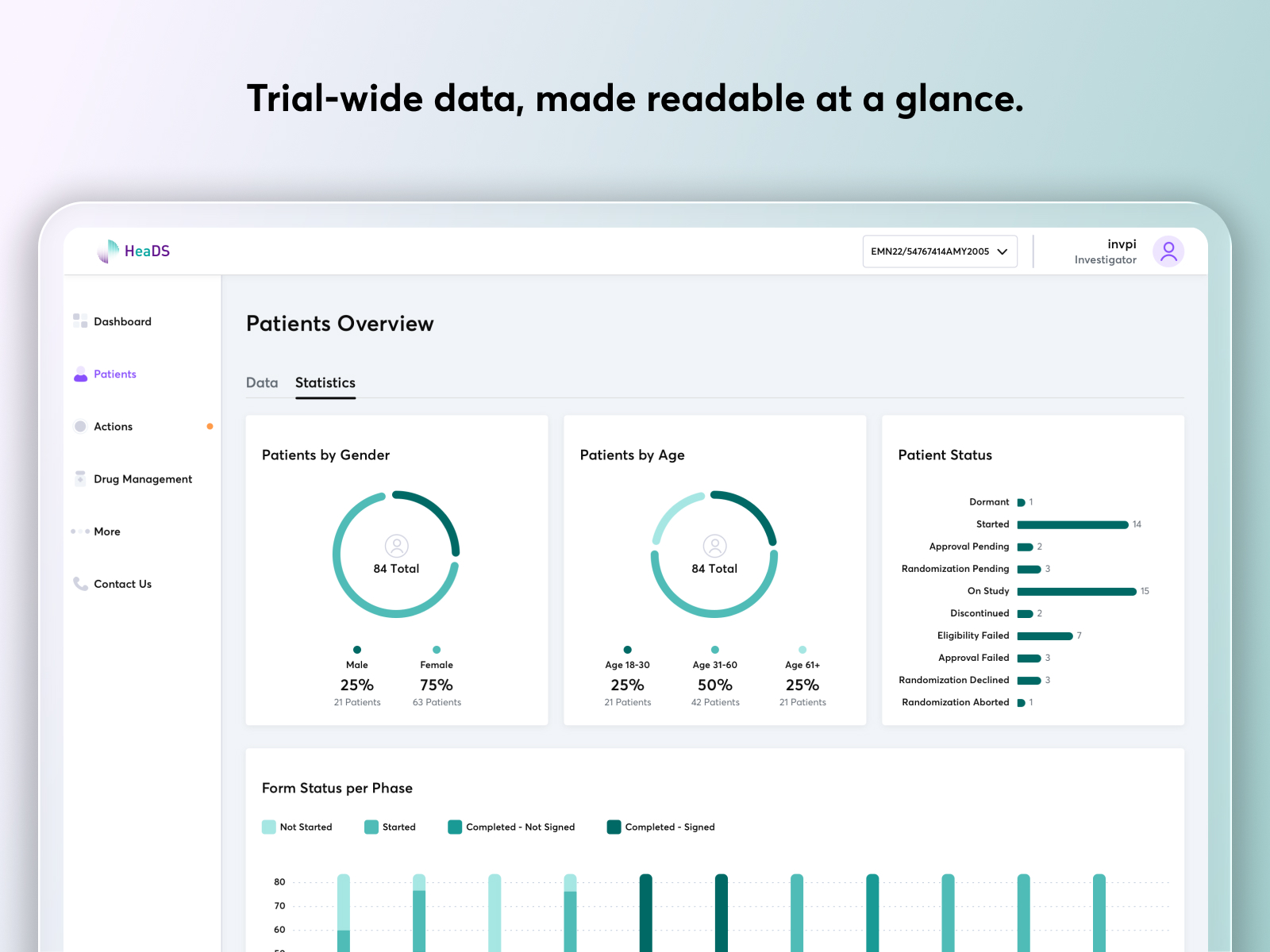
Investigator Analytics — A role-specific analytics dashboard showing patient data by age, gender, status, and form progress — paired with actionable cards that tell each role exactly where they need to act.
Supporting these were a redesigned top navigation with a site-switcher dropdown, an overhauled side menu grouped around how users actually work, and long forms restructured into guided step-by-step flows with optional fields hidden behind contextual questions.
The Patients Overview Page is the contribution I'm proudest of — and the one even stakeholders hadn't anticipated. Through discovery interviews, a pattern emerged: Investigators needed to locate a patient record fast, not by drilling through the trial hierarchy but directly by patient. No such access path existed in the platform. After mapping the workflow gap, I proposed a dedicated per-trial Patients view that collapsed what had previously been a 10-click process into a single interaction. Stakeholders recognised it immediately as addressing something they had struggled with but hadn't been able to articulate as a design problem. It reframed the entire platform around the patient — and became the most impactful addition to the redesign.
The client had no documentation — no personas, no flows, no user journey maps. Through weekly stakeholder interviews I mapped each of the five user roles, their responsibilities, and where the experience was breaking down, giving the project its first shared foundation from scratch.
I started with the dashboard and iterated through two rounds of wireframes with stakeholders — surfacing complexity that only emerged through conversation. Once validated, I moved to high fidelity, applying a consistent design language across all redesigned surfaces: forms, navigation, role-gated views, and the new Patients view.